

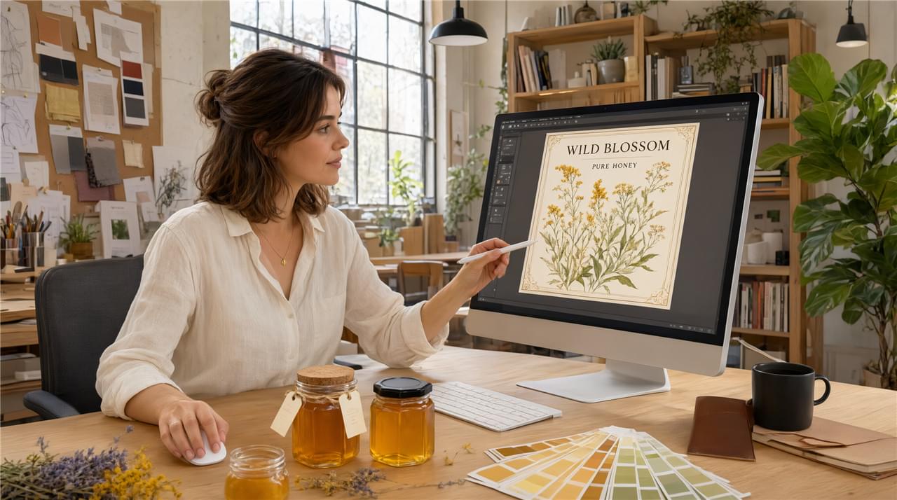
A honey label does three jobs at once: it carries the regulatory information, it carries the brand’s visual identity, and — when the honey label design is genuinely good — it converts a browser into a buyer before any other marketing gets a turn. In premium grocery, where a shopper gives each shelf section roughly three seconds, the label is the primary commercial asset. 🐝
This guide covers the design principles that separate effective honey labels from generic ones, plus the regulatory framework every label must satisfy. It zooms into the label itself; for the wider pack and program context, our honey OEM and private label pillar sets the scene.
The Anatomy of Effective Honey Label Design
Front of Jar: Where Honey Label Design Wins or Loses the Sale ⚡
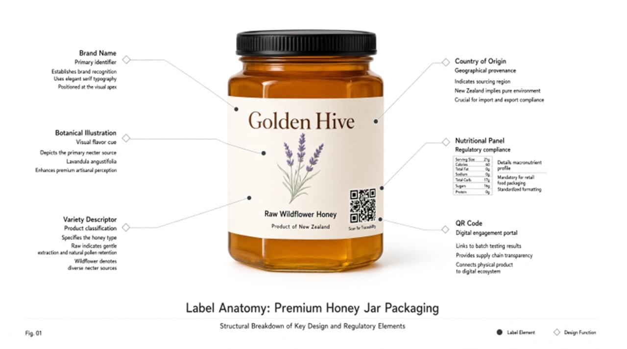
The front label has one commercial purpose — create desire and communicate positioning inside that three-second window. Four elements do the work:
Brand name hierarchy: the largest typographic element, set in a typeface that communicates character — heritage, artisan, modern, scientific — consistently.
Product descriptor: variety and origin (“Acacia Honey, Northeast China”) in a secondary hierarchy. Specific always beats generic.
Visual focus: one strong element — a botanical illustration, a honey texture photograph, a landscape watercolor, a geometric pattern — that builds recognition across the product range.
Color story: honey’s amber tones invite warm palettes, but contrast between label background and honey through the glass creates real depth. A dark kraft background can out-punch an amber-on-white approach on shelf.
Back of Jar: The Trust Layer of Honey Label Design 🛡️
The back label handles compliance and second-touch brand communication:
Mandatory information (EU reference): product name with botanical source if monofloral, net weight, best-before date, storage instructions, country of origin, packer/importer name and address, and a nutritional declaration per 100g.
Brand storytelling: the back has more space and less competitive pressure than the front. This is where the origin story lives — “Our bees collect from acacia groves across the Changbai Mountain region…” — where quality claims land (“tested to Codex Alimentarius standards“), and where sustainability credentials belong. For proven examples of this kind of narrative at retail, see our honey brand packaging cases.
QR code: linking to batch-specific traceability, origin photography, or a brand story video — a digital dimension premium food buyers increasingly expect.
Craft Details That Separate Premium from Generic
Typography: The Most Mishandled Part of Honey Label Design 🔤
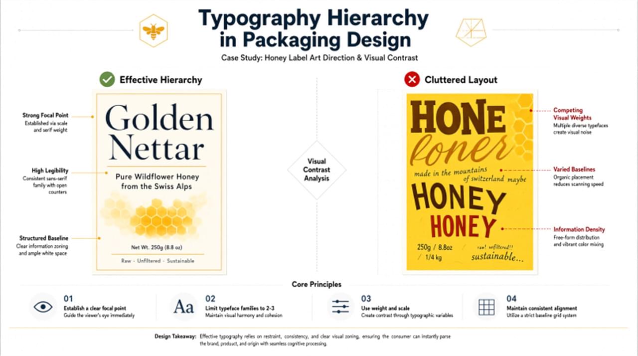
Typography is where sound product strategy most often falls apart in execution. Of all the honey product label design tips worth memorizing, three mistakes matter most:
Too many typefaces: two maximum — one for brand name and headlines, one for body text. More creates visual noise without brand coherence.
Wrong character: a font communicates before a word is read. Calligraphic scripts suggest artisan; clean geometric sans-serifs suggest modern premium; traditional serifs suggest heritage. Match the typeface to the positioning, not to personal taste.
Tight tracking on all-caps: all-caps typesetting needs increased letter spacing to stay legible at small sizes — the single most overlooked detail on food labels.
Color and Print Specs for Honey Label Design 🎨
- Color mode: CMYK for offset printing; RGB/Pantone for digital print. Specify Pantone colors for brand elements that need exact matching across print runs.
- Paper stock: uncoated papers in natural tones suit artisan positioning; coated gloss suits mainstream retail. Wet-strength coating is recommended for glass jar labels, which get handled in humid environments.
- Print finishes: hot foil stamping (gold, silver, copper, holographic) adds visible premium at modest cost; embossing adds a tactile dimension. Both work best as accents, never dominant elements.
These finishes sit inside the wider discipline of honey packaging branding — and they compound on gifting lines, where our premium honey gift box design guide shows how materials behave at gift-set price points.
Working with Delee on Honey Label Design 🤝
Delee’s private label program includes label design support. Our team can review your existing brand guidelines and adapt them for honey label requirements, provide layout templates for standard container formats, review artwork for regulatory compliance with your target market, and connect you with preferred design partners for full-service work. For a custom honey brand label built from scratch, that last option saves weeks of trial and error.
To start the conversation about your program, contact the export team at deleehoney.com/about-us/. 🐝